

Infographic Designer in Power BI
5 Years since it was released and I am only now realising quite how amazing this is!
I have used this tool a few times over the years but have never really grasped its capabilities. Making basic charts is pretty straight forward and there is quite a bit of documentation available. After some investigation there are a few more advanced examples that I have been able to adapt which I have included below.
In terms of guidance there are a number of guide videos on You Tube which go creating fill charts using shapes and some of the more standard use for instance these ones from Curbal: #37 Easily create infographics in Power BI with infographic designer and #D52 Easy and fast infographics in Power BI 📈
The official quick start guide is a really good and goes into a good level of detail on the capabilities of the tool. The videos and gallery on the original research site give a great overview of capabilities and I will embed a few of the most interesting below.
Demo Video
Demo Video
Demo Video
Some of My Ideas
I have used some of the above examples in reports to replace things like gauges with something more engaging and relevant to the measure being used. The one extra tip I would give from using these practically is to open the visual in full screen when you want to use the edit pane. This makes it a lot easier to make design changes as the edit pane will only be as big as the size of the visual on the screen so it can be quite difficult to see even if your chart is quite big.
Custom Icon Line Chart
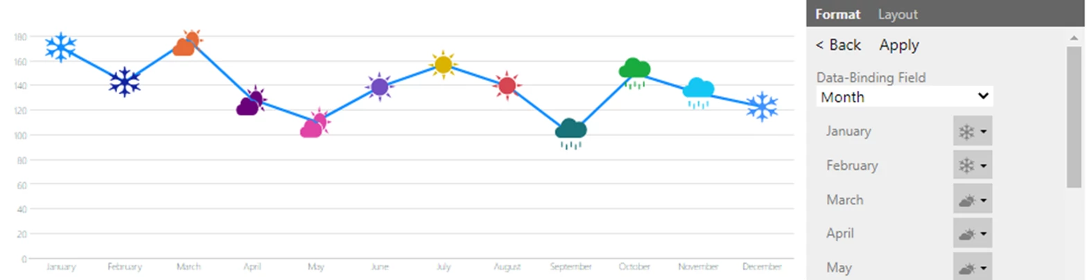 This is an quick example that I have created using the line chart option and overlaying a custom shape which I then bound to the Month which is the X-Axis of my chart. This allows you to customise the shape used and in the case of the above I have manually set these to represent weather to present seasonality but this could be useful for things like identifying the start of a global pandemic or lockdowns (to pull random hypothetical scenarios from the air).
Category Picture Charts
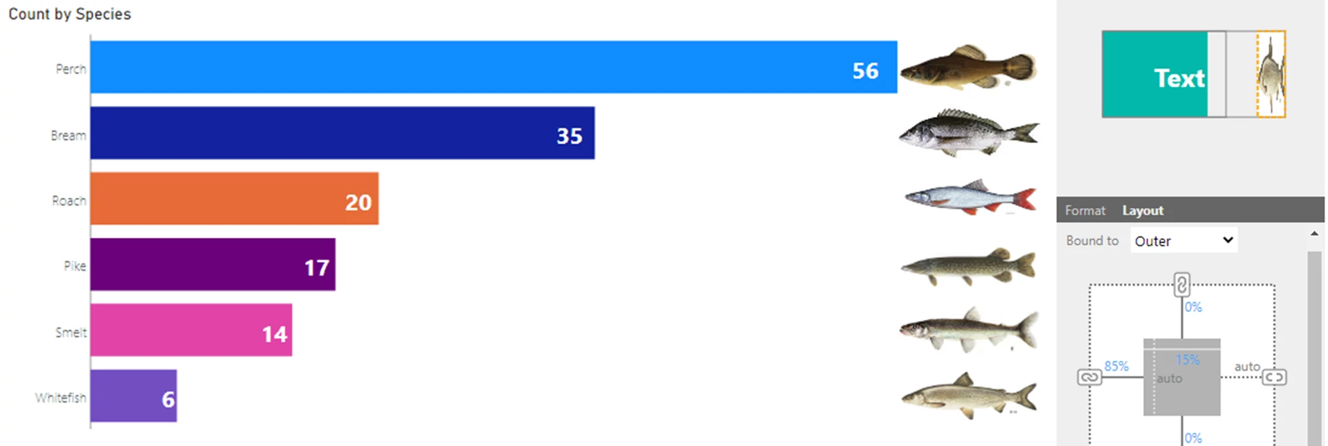 This example is really quite basic and adapted from some of the above. I think I have seen something similar in other custom visuals but this is quite a simple way of adding custom text, icon or image labels to a column chart (or bar chart).
Summary
I hope this has been helpful and given some ideas for the kinds of things that you can do with the infographic designer custom visual. The visual is defiantly not the most polished or dynamic custom visual available but I think it has some really powerful functionality and allows a degree of customization that is very cool.